

A-Z of the Future > Design
How we designed the A-Z of the Future
We partnered with Matt Tams to create the graphics for the A-Z of the Future. This work was a world first: original graphics that visually summarise a family of futurist ideas, technologies and social implications.
The design process was informed by the narratives of each of the 26 terms. Here's how Matt approached it:
Order from chaos; simplicity from complexity. The A–Z of the Future aims to make sense of a future ahead of us that can at first seem overwhelmingly chaotic and complex. This inspired the use of the grid: a complex and chaotic-looking device derived from pure geometry that brings order, simplicity, sense and consistency to the suite of icons.

From there, the icons themselves use a consistent language, prominently sharing four key themes to aid quick and easy understanding: people, time, direction, and Earth.
The command line interface that partially inspired the Into The Future logo is also referenced in the primary colour palette for this project. Whilst the chosen shade of green leans heavily into digital imagery, green was also favoured for its unique ability to straddle both the digital and natural worlds – a balance seen across the concepts addressed in the A–Z of the Future.
In application, the icons are partnered with Fractul and Fractul Alt. Like the font used for the Into the Future logo, Sora, this is another clean geometric sans serif typeface. However, in applying rigidly angular forms to only occasional characters, Fractul not only leans into the sense of mechanical precision already found in the use of the grid, but also nods to the human spirit of testing boundaries through experimentation (feeling like a spiritual descendent of the more abstract draft letterforms of the 1927 typeface Futura). Exhibiting both of these qualities made Fractul a great choice for this project.
We also applied a more subtle gold colour scheme as a separate option for posters, providing people with an alternative decorative aesthetic to the vibrant green and black.
Each icon explained:
Anthropocene
People, time and Earth quite make the anthropocene. Our existence on Earth is also a ticking clock, the only question being how quickly our time will run down.

Complexity
The concept of this icon is to show multiple networks of interconnected systems joined as oneoverarching web that defies untangling or understanding. And yet simple enough to be understandable.

Exponential Growth
Technology can change at an exponential rate, drastically altering our world. In this icon a graph is created using one quadrant of a globe, referencing overtly that our whole world is shaped by exponential growth.

Global Warming
Representations of the causes of global warming can feel abstract and distant, so instead this graphic focuses on its consequences. The rising water references the very present danger of more frequent flooding, as well as the longer term threat of rising sea levels. Will it lead to unpalatable 'high water marks' for what Earth can sustain?

Intelligence Explosion
This icon takes the image of a brain as a classical representation of human intelligence, from which an explosion of nodes bursts outwards, representing the speed at which artificial intelligence is poised to far outstrip our own.

Kinship
We attribute greater moral value to our kin than to others. The brick heart icon symbolises how we simultaneously love our kin, yet allow this love to put up walls to those we consider to be outside of these circles of kinship.

Myths
The Eye of Providence perfectly represents the human capacity for our entire outlook and value systems to be shaped and re-shaped by our faith in narratives and storytelling. Taking the quill as a symbol of human writing - free form and agnostic of technological input - three quills make separate but complementary contributions that build together into the Eye of Providence symbol.

Oblivion
Oblivion has quite literally ripped through the grid, leaving nothing other than an O-shaped hole. In applications where the grid isn't shown, oblivion is instead shown by a solid circle, as an alternative O-shaped symbol of this all-encompassing concept.

Quantification
As collection-able data about each person grows, the value of our individuality may stand to be diminished, with our otherwise complex traits and desires becoming increasingly easy to map as simple data points amongst a vast number of interconnected nodes.

Space Colonization
Living among the stars is a promise of the future that captures the imagination like no other. In this icon, the motif of a planted flag is combined with a shuttle zipping from planet to planet, representing the colonization of space.

Up/Down Politics
In each direction, the shapes of each arrow are turned into visual representations of these new political wings. 'Down' arrows become plants and leaves in the earth, whilst 'Up' arrows are left in the negative space of shuttles lifting off to explore space.

War
The crosshairs in this icon do the heavy lifting of how warfare is evolving to be ever more targeted to the individual, whilst remaining agnostic of whether this is achieved through such varying means as hypersonic missiles, miniature drones, or weaponised diseases.

Youtopia
A person sits at the centre of two highly recognisable motifs, where a rainbow (hope and joy) is partially suggested to be constructed of signal waves (tapping into familiar WiFi imagery). This hints at a personal utopia that could likely only be accessed through (for example) virtual reality, with rainbows also being a symbol of the intangible.

Biotechnology
The DNA strand is a ubiquitous and well understood symbol of biology. In years to come, how closely could biotechnology resemble organic biology, and how meshed could the two become?

Debordering
On one side of this icon there is neither any movement in, nor any movement out. Closed borders creating a bubble. On the other side, open borders create free movement. The icon is intentionally symmetrical in construction to highlight how different each side if with one change.

Fractured Reality
This takes an image of Earth as a visual representation of what 'reality' means to us, and splits it in half along a fractured fault line.

Hard Problem of Consciousness
Humans have subjugated other conscious animals by defining lower intelligence to mean lower moral worth - so what does the prospect of machine intelligence outstripping human intelligence result in?This icon places people at the centre of asking what consciousness is, what possesses it, and what moral value we ascribe to it.

Joblessness
Will joblessness be a positive or negative for humanity? This graphic juxtaposes both possibilities, with the similar silhouettes of each half hinting at how easily the balance could tip one way or the other.

Life Extension
Where the first third of this icon uses a solid arrow to represent the limited time presently in the hands of each person, a dotted arrow in the next third hints at the possibility of extending this time. No arrow is present in the final third of the clock, but completing the circle - immortality - would represent the logical conclusion of a pursuit to expand our lifespans.

Nanotechnology
The symbol of a virus is a very useful visual shorthand for the concept of 'nano'. Here, the idea of nanotechnology - which will have astounding health impact, and on other industries - is communicated by setting a computer chip within this virus symbol.

Panopticism
Panopticism refers to all-seeing surveillance. In this icon, Earth is spanned by an all-seeing eye, complete with an unblinking aperture iris to overtly represent the technology that makes global surveillance tangible.

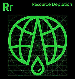
Resource Depletion
Earth's resources - from minerals to fuels, from oil to water - are finite. At our potential future rate of consumption, we easily run the risk of bleeding the Erth dry. This icon represents how draining the last drop of our natural resources could break the Earth as we know it.
Transhumanism
Modern life is filled with technological updates, often communicated through spinning cogs or loading progress bars. These motifs are combined with a person to suggest the increasingly tangible possibility of self-directed human evolution - or human 'updates'.

Virtual Reality
This icon takes the very recognisable idea that pixels mean digital or virtual, and combines it with an image of Earth as a visual representation of what 'reality' means to us. See also Fractured Reality (above) as another design interpretation of our changing concept of reality.

Xenophobia
An emotive and defiant graffitied downward slash is the only element of any of these A-Z icons that breaks beyond the grid. In doing so, it both vandalises the upward-moving circuitry within the icon, and rejects the broader movement of technology being ever more closely integrated with society and with individuals.

Zero Hour
With a diagonal alignment inspired by a slashed zero, this icon shows one half of a clock face in light, and the other half cast in complete shade. Can we be ready for unknown new dawns to come? This icon has positive and negative versions to ensure that the clock is always half in light.
